This article contains spoilers on the winner of the 2022 Best MODX Website Award. If you want to watch the full award show in order, watch it here first.
At this years' MODXpo, we awarded the first Best MODX Website Award. Anyone that joined the conference, including those joining online, could submit their website to be judged. As there was only a short period of time for submissions, there were only 19 sites in total, but nonetheless we saw some amazing creativity from the community.
Judges were representatives of modmore (Isaac, Marc, & Murray) and MODX (Mat), who each scored the site based on performance, design, and accessibility. The average of each company's judges was combined (up to 50 points), leading to a maximum total of 100 points.
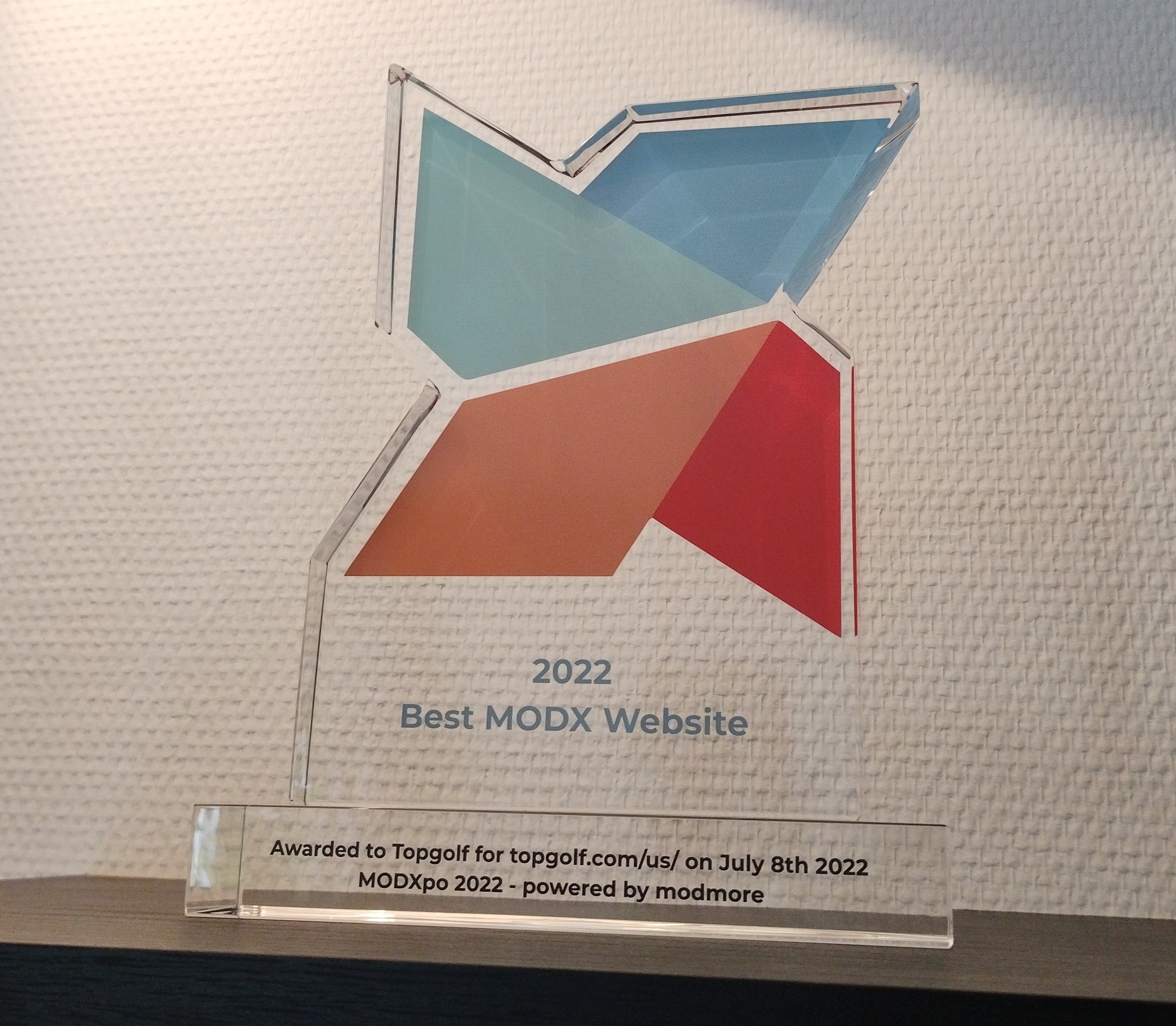
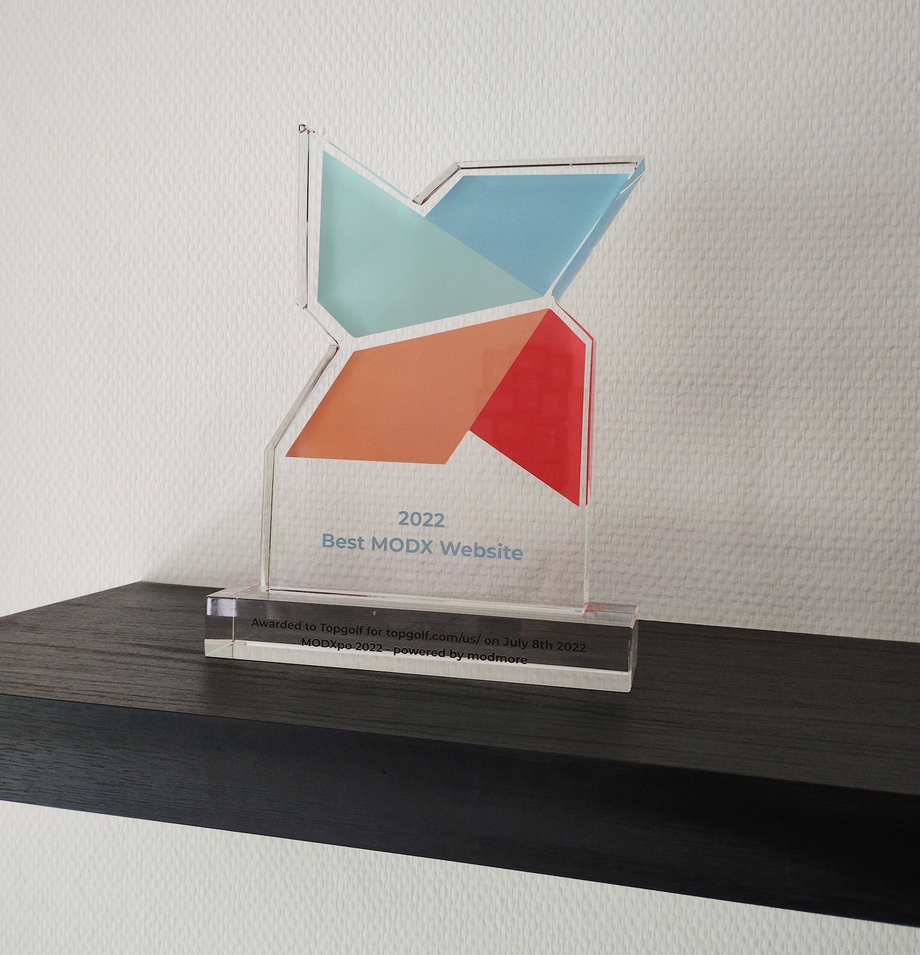
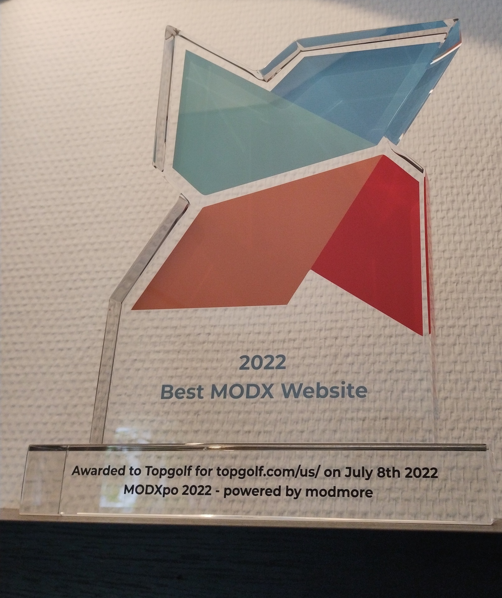
The winner received the first-ever custom-made 2cm thick and 22cm tall crystal glass MODX award:
It's quite the trophy, and I did feel a little bit sad it was only on my shelf for a short time, before shipping it off to Topgolf in Dallas, TX, USA.
So let's talk about the judging!
Determining the Best MODX Website
In an effort to make the reviews as objective as possible, while faced with very subjective factors, we focused on three key areas.
First, performance.
The Best MODX Website should have speeeeeeeeed.
Most points (26) were based on the Core Web Vitals (CWV) score: we'd use Google's Page Speed Insights to test each site at least three times, record the highest mobile and highest desktop scores, and determine the average score (rounded down) between those two. That was also repeated a few days later at a different time, to avoid temporary issues bringing a site down, though no points were affected by that additional test.
The CWV score then got turned into points; for example a score of 80 would be 20 points (80% of 26 = 20). The highest CWV scores in the competition were for Waterlogic (GEL Studios) and Biocompany (Raffy), with a whopping 91/100!
The judges were also asked "How fast does the website feel?", for up to 10 points. This made sure sites that may have optimizations beyond what CWV can measure were not penalized, and the user experience was actually taken into account.
Performance overall was fairly good with 24 points on average. MODX helps making things speedy, so that's no surprise. The site with the highest performance score in the competition was the #10, Fett & Wirtz, submitted by lux-medien with 31.5 points!
Secondly, design.
By far the most subjective category.
To try and guide the reviewers into consistent and fair scoring, they were given the following categories/questions and guidance on scoring.
- Creativity. How unique is the site design? Is it a standard brochure website, or is it a more unique experience? Does it have unique elements not commonly seen? Does it breath creativity or is it pretty standard? Note that "creative" does not have to mean "pretty". (10 points)
- Typography. How legible is the content? Does the vertical rhythm add up? Are fonts (sizes, colors, types) used consistently? (10 points)
- User Experience. How user friendly does the site appear to be to you? Is it easy to use, easy to navigate, logical layout/progression through the site? (10 points)
- Use of media. Use of photos, illustrations, videos, etc on the website. (4 points)
- Bonus point. If you're very impressed with the design of this website, you may give it a bonus point. (2 points)
Design scores were quite good. Out of 36 max points for Design, the average is 27.7.
The #2 in the competition, Biocompany submitted by Raffy, managed to score the full 36 points for Design which is quite the feat!
Finally, Accessibility.
Even though we did not do a full accessibility review and there were only 28 points to earn, this was definitely the harshest category. On average, the sites in the competition scored just 12.3 points.
For the Accessibility review, judges were given the following categories/questions and guidance on scoring:
- Keyboard navigation. The "tab check" is a simple but effective way of testing the accessibility of a website. Are you able to use the keyboard exclusively to browse the website, or accomplish its goals (e.g. make a purchase, get in touch)? (10 points)
- Semantics & A11y issues. Open Axe or the a11y inspector in developer tools. Does the accessibility structure and tab order make sense? Check for any issues that are flagged - how much issues does the site have? What impact do they have? Scoring suggestion: 3 for some minor issues (no alt text on presentational elements), 1 if there are major issues (consistently lacking sufficient contrast or critical flagged issues), and 5 if it's clear a11y was a key concern during the development and no major issues exist. Issues in the content should be judged a little less harshly than issues in the overall template to compensate for client behavior. (10 points)
- Bonus: tab to content. Does the site have a "tab to content" feature in the header that activates when hitting tab at the top of the page? (2 points)
- Bonus: customizable font size. Does the site have either a widget on-page to increase the font size? If not, does it a least allow the font size to scale with ctrl/cmd +/- or zooming without breaking? (2 points)
- Bonus: supports increased contrast or system dark mode. Does the site offer an on-page widget to increase contrast or supports system dark mode? (2 points)
- Bonus: print styles. Probably most worthwhile testing on a content page users might want to print instead of the homepage. (2 points)
The highest accessibility scores were for the winner of the competition Topgolf (21 points), and #5 Light Forms (20 points) submitted by Netlux Solutions.
The most common accessibility issues were in missing focus styles when using the keyboard to navigate, and insufficient contrast on headers or call to action buttons.
Again, this is not even close to a thorough accessibility review that goes into the full WCAG guidelines, or tests how the site works with screen readers: we only checked the most basic requirements of basic accessibility and issues flagged by automated tooling that's freely available.
I'd like to challenge the community to up their game in terms of accessibility, as creative freedom does come with responsibility, too. Assuming you're already testing cross-browser or cross-device compatibility as part of your development workflow, plan an extra 30 minutes to do the same for accessibility, and you'll easily get an extra dozen points at the next Best MODX Website award. (And make your websites more accessible, too!).
Top 10
With all points counted and numbers wrangled, the final top 10 is as follows.
| Website | Submitted by | Performance (36) | Design (36) | Accessibility (28) | Total (100) |
|---|---|---|---|---|---|
| topgolf.com | Topgolf | 26.00 |
34.00 |
21.00 | 81.00 |
| biocompany.de | Raffy | 30.00 | 36.00 | 8.50 | 74.50 |
| looox.nl | Adwise | 26.50 | 34.50 | 11.50 | 72.50 |
| gelstudios.co.uk | GEL Studios |
25.50 | 32.50 | 12.50 | 70.50 |
| lightforms.com | Netlux Solutions |
19.50 | 29.50 | 20.00 | 69.00 |
| waterlogic.com | GEL Studios |
28.00 | 29.65 | 9.87 | 67.52 |
| ace-net.ca | Spectacle Group | 26.33 | 21.33 | 18.65 | 66.31 |
| werkenbijthales.nl | Adwise | 23.50 | 29.00 |
13.00 | 65.50 |
| decentgroup.co.uk | GEL Studios |
25.50 | 29.00 | 9.50 | 64.00 |
| fett-wirtz.de | lux-medien |
31.50 | 20.00 | 11.50 | 63.00 |
For the remainder of the ranking, download the results here. (If there is a discrepancy between the table above and the PDF, the PDF is the authoritative source.) If you want to know some more detailed feedback on why your site scored a certain way, just email mark@modmore.com and I'm happy to share the judges' comments with you privately.
As there was a bit of a conflict of interest with scoring Topgolf as the MODX team were involved with building the backend while the Topgolf in-house team did the front-end, only the modmore scores counted on that site. If we had included the MODX scores the ranking wouldn't have changed, but it's good to avoid any such bias regardless.
I do want to highlight the lead Topgolf has on Biocompany is just 6.5 points, despite them having 12.5 more points in Accessibility! The same is also true for the comparison with Looox: a 8.5 point lead overall, with 9.5 points more in Accessibility. For this particular top 3, the kicker truly was the accessibility.
Further down in the list there are other interesting ways the ranking could've gone with improved Core Web Vitals scores as well; for example Light Forms at #5 scored really well overall but lost a lot of performance points due to large optimized images. Had those been fixed, it would've only taken 5 extra points to become #2!
Now that you've had a taste for the award and a first look at the actual award, I'm sure we'll see a much more competitive competition next time, with people improving their sites' accessibility and reviewing the Core Web Vitals score when submitting them. I can't wait to see the submissions next time!
What could be improved?
As this was the first time, I think it's worth discussing ways to improve the award process next time. This is also based on the attendee survey we sent out, and feedback I got during the event and the social afterwards.
More MODX
The most common improvement point people have asked for is going deeper into the MODX side of things. One of the survey responses mentioned that "these sites could've been built with any CMS", which is certainly a point to consider.
I don't think that necessarily makes the award less worthwhile to aspire to, as they're still true to the title, but it does illustrate people want to know more about the MODX-specific challenges faced.
Trying to dig deeper than we did, though, does pose a new challenge in not raising the bar to entry too much.
We already had people who chose not to submit because they didn't think they'd have a chance, or because they were afraid of having to come on stage to show it off if they did make it to the top 3, and if we start asking people for a manager login that might be an even bigger deterrent to submissions. Perhaps there is a technical solution for this, where for future award shows we create an extra for the submission process, which will give temporary and properly restricted (read-only) manager access at the click of a button.
More chances to win
I think we also need to offer more chances for people to win. A single award (and chocolate bars for #2 and #3) means just one shot at a prize, which is also discouraging to especially smaller agencies or independents who don't expect the odds to be in their favor.
We could offer 2nd and 3rd prizes a smaller version of the award as well in the future, though that would make it a lot more expensive to run as the custom award costs €200 to make (smaller ones will be cheaper, but likely not below €130-ish).
I'd probably suggest going with these 3 categories in the future:
- Best Design (or Best Front-end, or Best Website), basically the same award and reviews as we did this year. Fine-tune the scoring a bit (I'd lower the points given for CWV as some sites got hit very hard due to some hero videos), and perhaps invite external experts to review each category (e.g. recognized design experts to score the design, and accessibility experts to score the accessibility) instead of all judges reviewing all sites in all categories.
- Best Theme. We had one theme submission this year but as Ryan also mentioned wanting to promote themes more, it makes sense to give that its own category. This category would require manager access to inspect the way the theme may be customized or used, and also scores the front-end in a similar way to Best Design.
- Best Build, which also requires manager access to submit, but goes into technical MODX aspects specifically: how well is the site structured, does it have any interesting integrations or custom aspects, what's the editor experience like, etc.
Best Design would likely still be the largest and most desirable category, but the others would allow diving deeper into the technical aspects.
There could even be categories for Best Extra, or more specific verticals like Best Ecommerce, Best Web App, Best B2B, etc. Having more awards will increase people's odds and make sure that the very deserving agencies and independent developers around the world have a fair shot.
Do we also want non-attendees at a MODXpo to be able of submitting their sites? I'd personally say it's fine like this (in a hybrid conference, anyone can technically join), but there's no reason the award couldn't be hosted as a separate (online?) event that's open to anyone to submit sites for a small fee.
More time to submit
Because this MODXpo was organized at such short notice (just 3 months!), the award had a 2-3 week delivery time, and judging takes time too, there were only a few weeks for people to (1) hear about the award and (2) submit their sites. This left out a fair bit of people and great submissions.
Assuming future MODXpos are planned a little further out again like normal, this would be less of a challenge moving forward, though of course with more categories there will also need to be more time to review the sites.
I'm very grateful the judges managed to complete the reviews for this award in just one week, as I made a mistake in the planning and didn't realize the award almost had to be ordered when I opened up the form for submitting the reviews.
Simpler processing
This year we used a Google Form to collect individual reviews, and luckily we only had 19 sites submitted, as it was a lot of work collecting the final scores from 62 submitted reviews!
Obviously the judges did most of the work, but it really shouldn't take 3 different spreadsheets and 2 days of work to finalize the scores once all the reviews are in. I greatly underestimated that work, and it definitely needs to be automated in a better way in the future if we want to handle more submissions and different categories to review. This probably needs a custom (open source) application for the judges to submit their reviews to, which will then spit out the full ranking in accordance with the rules without further manual processing.
Announcement videos & interviews
Most people I spoke to appreciated the little videos that I had made for the award. I'd definitely do those again, but instead of 10 individual videos, it may be worthwhile to do #10-#4 in a single video to keep things moving more fluidly. And with multiple categories, it probably makes sense to only do the top 7 or so, to avoid it taking all day.
While I think that overall the interviews with the top 3 were nice, they should've been prepared better. As the award was focused so heavily on the front-end, some of the things that make the sites unique weren't really discussed. Some of the questions in the interviews also "misfired" which better preparation could've avoided. Definitely need to plan a call with the top 3 to prepare for their interviews ahead of the conference next time, just like Kjell had done with each of the speakers.
In closing
Congratulations to Topgolf and the rest of the top 10 on their great rankings!
I'm definitely looking forward to see how the Best MODX Website Award will evolve over the years, especially as we get different MODXpo organizers with their own ideas to improve it, and we get more and even better submissions now people know what's at stake and how the scoring works in detail. Hopefully we can remove some of the roadblocks to submitting sites that this MODXpo had, and get these awards placed prominently in offices all over the world.
Also, it's ridiculously hard to take a nice picture of a glossy and very reflective award without a proper studio or equipment.


Of course if you have any thoughts on the submission, scoring, or the award show, drop them in the comments below (or email me via mark@modmore.com).
Feedback is most welcome!